Sometimes it’s the little problems in life that can be so challenging, but when solved are the most rewarding. As such is my experience with changing the colors on the Android TabWidget object. I spent several days and nights searching for documentation, reading the responses to questions other developers have posted, trying different things to get this simple problem solved and finally the “AHA!” moment came last night during my sleep. I woke up this Sunday morning at 6 AM with the solution on my mind. So for about an hour and half before going to church, I solved one of the greatest programming challenges I’ve faced in many years—how to change the tab colors on the Android TabWidget and keep the dividers in their proper place.
Some of you might have this figured out already, but from the great number of unanswered questions on the net, I’ll assume most haven’t. There’s so little documentation for some of these more esoteric Android features. The books I’ve read are good to get someone started with Android, some are even helpful. But I haven’t found one yet that teaches the common tasks programmers are likely to do when they’re coding.
The answer to my question was right in front of me the entire time. I found the solution in the Android SDK. I’m coding my app for Froyo or higher. The minimum SDK version for this solutions is 8. I have not tested to see if it works on the previous SDK versions. You’re on your own for that.
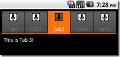
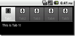
To illustrate what I’ve done, take a look at the two emulator screen captures below.
 Fig 2. Modified Blue Tabs Fig 2. Modified Blue Tabs |
The goal is to allow users to choose between a dark (Fig. 1) and light (Fig. 2) color scheme. The choice is made in a CheckBoxPreference object through the Preferences framework.
As soon as a user selects or deselects the Light Colors checkbox, the tab screen changes color immediately upon returning to it from Preferences.

To modify the tab colors, first copy tab_indicator_v4.xml or tab_indicator.xml from android-sdk-windows\platforms\android-8\data\res\drawable to the res\drawable folder in your project. If you don’t have a res\drawable folder, create it and then copy the file from the SDK. The content of the file is:
<!-- Copyright (C) 2008 The Android Open Source Project

     Licensed under the Apache License, Version 2.0 (the "License");
     you may not use this file except in compliance with the License.
     You may obtain a copy of the License at

          http://www.apache.org/licenses/LICENSE-2.0

     Unless required by applicable law or agreed to in writing, software
     distributed under the License is distributed on an "AS IS" BASIS,
     WITHOUT WARRANTIES OR CONDITIONS OF ANY KIND, either express or
implied. See the License for the specific language governing
     permissions and limitations under the License.
-->

<selector xmlns:android="http://schemas.android.com/apk/res/android">
    <!-- Non focused states -->
    <item android:state_focused="false" android:state_selected="false"
android:state_pressed="false"
        android:drawable="@drawable/tab_unselected_v4" />
    <item android:state_focused="false" android:state_selected="true"
android:state_pressed="false"
        android:drawable="@drawable/tab_selected_v4" />

    <!-- Focused states -->
    <item android:state_focused="true" android:state_selected="false"
android:state_pressed="false"
        android:drawable="@drawable/tab_focus" />
    <item android:state_focused="true" android:state_selected="true"
android:state_pressed="false"
        android:drawable="@drawable/tab_focus" />

    <!-- Pressed -->
    <item android:state_pressed="true"
android:drawable="@drawable/tab_press" /> </selector>
The @drawables in this file control the appearance of the tabs in their various states, i.e. pressed, focused, selected, etc. These drawables are .png graphics located in your project’s drawables-hdpi directory. You can get the graphics referenced in this file from the drawables-hdpi directory for the platform of your choice in the Android SDK. You assign this file as the background resource for your tabwidget.
I created two versions of this .XML file. The first is for the dark theme, the other for the light theme. The only difference is the name of the @drawables graphics I’m using in each. To make the blue selected and unselected .png graphics I made copies of tab_selected_v4.9.png and tab_unselected_v4.9.png from the SDK. Then I used the color replacement tool in Photoshop to create the new images.
The following Java example is a custom method I wrote for my app’s tab activity to set the background resource to either file based on the user preference IsLightColors.
protected void setTabColors() {
/** * Before we do anything, determine saved value of
IsLightColors */
MyApp app = (MyApp) this.getApplication();
IsLightColors = app.RetrieveBoolean(getString
(R.string.LightColorsKey));
/** set the color scheme based on IsLightColors user pref
*/
View myLayout = findViewById(R.id.main_layout);
if (IsLightColors) {
myLayout.setBackgroundColor(Color.WHITE);
for (int i = 0; i < tabHost.getTabWidget()
.getChildCount(); i++) {
tabHost.getTabWidget().getChildAt(i)
.setBackgroundResource(R.drawable.tab_indicator_v4_light);
}
} else {
myLayout.setBackgroundColor(Color.BLACK);
.getChildCount(); i++) {
tabHost.getTabWidget().getChildAt(i)
.setBackgroundResource(R.drawable.tab_indicator_v4);
}
}
}
This code snippet references app.RetrieveBoolean. You won’t find this method in Android. This is another custom method I wrote for an app-level extension library. Using this method, we obtain the value of IsLightColors from the Preferences framework and the if statement does the rest!
Now before you point out any coding inefficiencies like the duplicate code blocks you see in the if-else construct, please note that I’m all for writing functional code in the smallest chucks possible. Code efficiency must be a priority especially when writing for small, portable, memory challenged devices. setTabColors() refactored for efficiency looks like this:
protected void setTabColors() {
/* * Before we do anything, determine saved value of IsLightColors */
MyApp app = (MyApp) this.getApplication();
IsLightColors = app.RetrieveBoolean(getString(R.string.LightColorsKey));
// set the color scheme based on IsLightColors user prefs
int tab_indicator = IsLightColors ? R.drawable.tab_indicator_v4_light : R.drawable.tab_indicator_v4;
int layoutColor = IsLightColors ? Color.WHITE : Color.BLACK;
View myLayout = findViewById(R.id.main_layout);
myLayout.setBackgroundColor(layoutColor);
// set the background resource for each
for (int i = 0; i < tabHost.getTabWidget().getChildCount(); i++) {
tabHost.getTabWidget().getChildAt(i).setBackgroundResource(tab_indicator);
}
}
}
Notice the if statement is gone and there is no duplicate code. Writing more efficiently means greater speed in execution. I certainly hope this has shed some light on the tab color issue and helped you in your quest to customize your tabs.


No comments:
Post a Comment